Matching Anime Tattoo Ideas: How to Coordinate Designs for Couples, Best Friends, and Siblings
Getting anime-inspired tattoos with someone else is different from getting one on your own. You’re not just choosing a design you like — you’re coordinating two pieces that need to hold up as a set, on two different bodies, possibly for two people who don’t even watch the same shows. Most advice on matching anime tattoos skips straight to naming a specific character pair and assumes you and your partner, best friend, or sibling already agree on a favorite series. This guide covers what to do when that’s not quite true, and how to plan a matching set that actually works — from how similar the two pieces should be, to sizing and placement, to briefing the plan to an artist, with the American Academy of Dermatology’s tattoo safety guidance as a useful reference for both people going in. For general anime tattoo browsing beyond matching sets, InkShonen’s full library of anime tattoo ideas is a good place to start.
Table of Contents
Table of Contents
What “Matching” Actually Means (the identical-vs-thematic spectrum)
“Matching tattoos” gets treated like it only means one thing: two people with the exact same image on their skin. In practice, matching anime tattoos work on a spectrum, and picking the wrong point on that spectrum is one of the most common reasons people end up unhappy with a design months later.
At one end are fully identical designs — the same artwork, same size, same placement, reproduced on both people. This works best when both people genuinely want to wear the same image and don’t mind that it reads as “his and hers” or “a set” rather than something personal to each of them.
In the middle are complementary or paired designs. These aren’t the same image, but they’re built to relate to each other — two halves of one idea, two symbols that only make full sense side by side, or two pieces that use the same visual language without being copies of one another. This is usually the best fit for people who want their tattoos to connect without losing their individual meaning.
At the far end are thematically-linked designs that don’t look alike at all on the surface, but share an idea, a color story, or a style choice. Two completely different anime-inspired images, done in the same linework style and the same palette, can read as clearly “matching” to anyone who sees them together — even though neither design references the other directly.
None of these options is more “real” than the others. The right choice depends on what you and the other person actually want out of it: a literal match, a connected pair, or a shared feeling expressed two different ways. Deciding where you land on this spectrum before you start sketching ideas saves a lot of back-and-forth later.
Pairing by Symbol or Motif
If you don’t want to build your matching tattoos around a specific character, symbols and motifs give you a way to connect two designs without either person needing to commit to the same exact image.
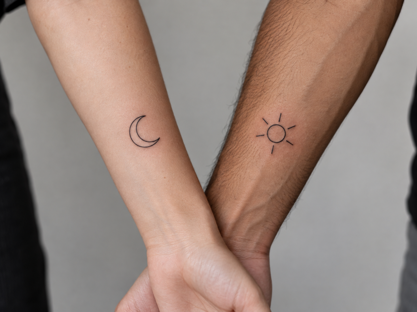
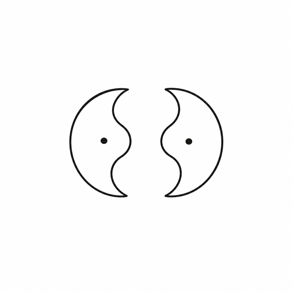
A shared or complementary symbol is the simplest version of this. Both people get a version of the same symbol — a moon and a sun, a single motif split so each person wears half of it, or two small marks that only complete a larger shape when the two of you stand together. This approach works well for people who want a private, low-key nod to their connection rather than something immediately obvious to strangers.
Opposite-but-related imagery is another option. Instead of matching symbols, you choose two images that clearly relate to each other by contrast — the idea of balance, tension, or complementary opposites translated into two separate but connected pieces. This gives each person a design that’s fully their own, while still reading as a pair.
The advantage of building around symbols and motifs instead of named characters is flexibility. You’re not locked into a specific series, so if one of you moves on to a new favorite show, the tattoo’s meaning doesn’t age out with it. The pairing lives in the symbol itself, not in a reference that only makes sense to people who watched the same episode.
Keeping Style and Color Palette Consistent
Even when two designs show completely different subjects, style and color palette do most of the work in making them read as a matching set. This is the option that solves the most common real-world problem: you and the other person like different anime, but still want your tattoos to visibly belong together.
Linework consistency is the first lever. If both pieces use the same weight of line — both bold and graphic, or both fine and delicate — they’ll feel connected even if the subjects have nothing to do with each other. Mixing a heavy blackwork piece with a delicate fine-line piece breaks that connection, even if the subject matter is a perfect thematic match.
Color palette is the second lever. Two anime-inspired designs that use the same two or three colors, in the same proportions, will read as a set from across a room. This is especially useful for people who want something that looks intentional in photos — a shared palette does more visual work than a shared subject.
Level of detail and shading approach matters too. A highly detailed, shaded piece next to a flat, simple outline can look like they came from two different projects entirely, even in the same color palette. Matching the general complexity of the two designs — not making one dramatically more intricate than the other — keeps the pair feeling balanced.
None of this requires the two designs to share a subject at all. A shared style and palette can turn two entirely unrelated anime-inspired images into a set that clearly belongs together.
Coordinating Size and Placement Across Two Different Bodies
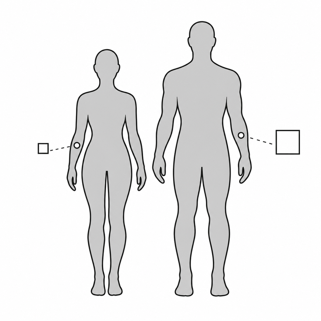
Placement and sizing get more complicated the moment two different people are involved, because a design that looks proportional on one body can look oversized or lost on another. For the general factors that make one placement work better than another — pain, durability, and how a spot wears over time — InkShonen’s guide to placement for anime tattoos covers the fundamentals. This section is specifically about coordinating that placement across two people, which is a different problem.
The first decision is whether “matching” size means the same literal measurements or the same proportion relative to each body. Two people with very different builds rarely look right wearing tattoos of identical physical dimensions — a design sized for a smaller forearm can look cramped on a larger one, and the same design scaled up can lose the fine detail that made it work in the first place. Matching by proportion, rather than by exact inches, usually produces a pair that looks intentional on both people rather than a pair that looks like one size had to be forced to fit.
Placement mirroring is the second decision. Some pairs choose the exact same spot on each body — both on the inner wrist, both on the same side of the ribcage — which reads as clearly deliberate and matched. Others mirror the placement, with one design on the left side of one person and the corresponding design on the right side of the other, which can feel more natural when the two pieces are meant to face or complement each other rather than sit in identical spots.
It’s also worth planning for the fact that the same body area can behave differently on two different people. A placement that heals easily and wears well on one person’s skin type or lifestyle might be a higher-maintenance choice for the other. Bringing this up with your artist before finalizing the plan avoids ending up with two pieces that were meant to match but need very different levels of upkeep.
Briefing a Coordinated Design to Your Artist(s)
A matching tattoo is really one project with two outputs, and it helps to brief it that way rather than presenting two separate, unrelated requests.
If you’re both working with the same artist, bring both people to the consultation together whenever possible. Explain the pairing plan as a single concept — the spectrum you’ve chosen (identical, complementary, or thematically-linked), the shared style and palette decisions, and how the sizing should relate across both bodies — rather than describing each tattoo in isolation and hoping the artist connects the dots. An artist who understands the full pairing can make small adjustments to each piece that keep them working together, even if the designs aren’t identical.
If you’re using two different artists, coordination takes more deliberate effort. Share the same reference material, palette notes, and sizing logic with both artists ahead of time, and be upfront that the two pieces need to function as a set. It’s reasonable to ask one artist to review the other’s sketch before either appointment, especially for pairs built around a shared symbol or motif that needs to look consistent from both sides.
Either way, treat the consultation as the place to lock in the shared decisions — spectrum, style, palette, and sizing logic — before either tattoo actually gets started. Changes are far easier to make on paper than after one half of the pair is already inked.
Matching Tattoo Ideas by Category
Rather than picking a specific franchise and hoping it fits both people, it helps to think in categories. Each of these works as a starting point regardless of what anime either person actually watches.
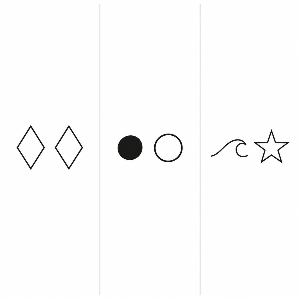
Symbol-pairing ideas center on a single motif shared or split between two people — a paired set of small marks, a symbol that only reads as complete when both pieces are seen together, or matching stylized versions of an element like a star, a wave, or a blade. These tend to work well as smaller, quieter pieces. Readers who want something in this smaller, subtler range may also want InkShonen’s guide to small anime tattoo ideas for scale and placement inspiration that applies just as well to a paired design.
Style-pairing ideas let each person choose their own subject entirely, connected only by a shared execution style. A bold, graphic linework approach applied to two completely different anime-inspired scenes will still read as a matched set. This is the most flexible category for people whose taste in anime doesn’t overlap much, since the connection lives in how the pieces are drawn rather than what they depict.

Palette-pairing ideas work the same way, but the connective thread is color rather than line style. Two different subjects, rendered in the same two or three colors, can look like a deliberate set even when the imagery itself is unrelated. This category pairs naturally with more illustrative or painterly approaches — readers interested in that direction may find InkShonen’s guide to manga panel–style anime tattoos useful for seeing how a distinct visual style can carry a design on its own.
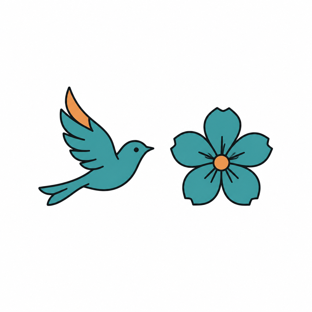
Across all three categories, the goal is the same: pick the layer that connects the two tattoos — symbol, style, or palette — and let each person’s individual design vary everywhere else. That’s what keeps a matching set from feeling like two people wore the same shirt by accident.
FAQ
Do matching tattoos have to be identical?
No. Matching tattoos exist on a spectrum, from fully identical designs to pieces that are only connected by a shared style or color palette. Identical works well when both people want the same image; a looser connection works better when the goal is to feel linked without both people wearing an exact copy.
What if we like different anime?
Different taste in anime doesn’t rule out a matching set. Building the pair around a shared style, color palette, or symbol — rather than a specific character or series — lets each person choose a subject they actually connect with while still reading as a matched pair.
Should matching tattoos be the same size?
Not necessarily by exact measurement. Because bodies differ, matching by proportion — how the design scales relative to each person’s build — usually looks more intentional than forcing identical physical dimensions onto two different bodies.