Solo Leveling Tattoo Ideas: Original Designs and How to Get the Shadow Monarch Look Right
If you’re searching for Solo Leveling tattoo ideas, you’re probably picturing something specific: dark shading, a hint of armor, maybe a glowing eye cutting through the black. That instinct is right. Solo Leveling’s visual identity is built on shadow and contrast, and a tattoo that captures it needs a different approach than a typical bright, flat-color anime piece — heavy shading and solid black fields also heal differently, which the American Academy of Dermatology’s tattoo safety guidance touches on.
This guide walks through what actually makes a Solo Leveling-inspired tattoo work, how to decide between black-and-grey and color, a set of original design directions to bring to your artist, what placement and scale the style demands, and how to pick an artist who can execute it well. Every design idea here is an original interpretation inspired by the franchise’s aesthetic — not a copy of any official artwork, panel, or screen.
Table of Contents
Table of Contents
What Makes a Solo Leveling Tattoo Work
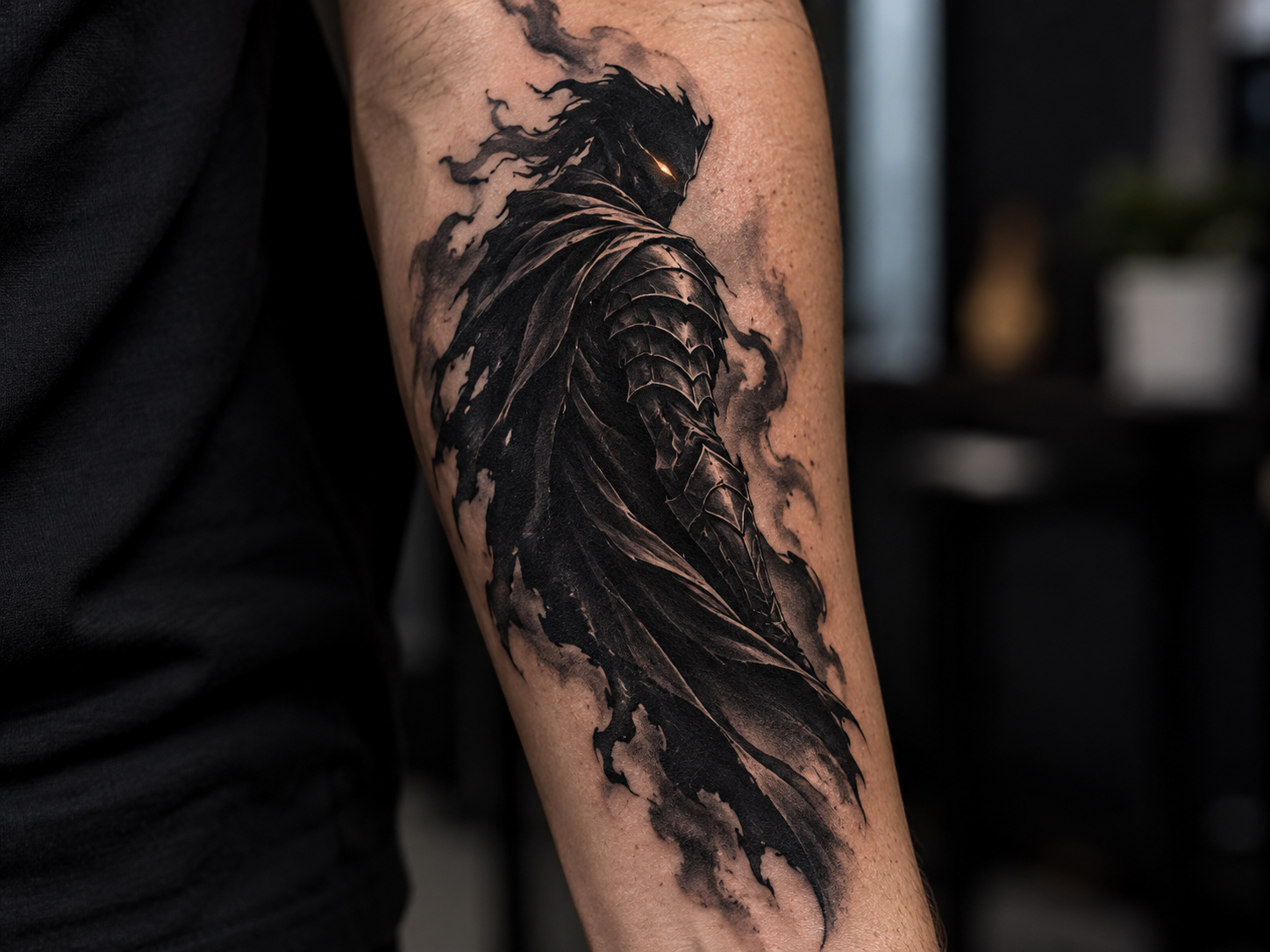
Solo Leveling’s tattoo appeal comes from a specific visual register: heavy shadow work, armored silhouettes, and a recurring glow — usually a single eye or a thin line of light — breaking through deep black shading. This is a darker, more atmospheric look than the flat, saturated color style common in a lot of shonen tattoo art.
A tattoo that reads clearly as “Solo Leveling-inspired” typically leans on three elements: dense blackwork or shadow shading as the base, an armored or cloaked figure as the subject, and one point of contrast — a glowing eye, a thin rim of light, an ember-like accent — to keep the piece from reading as a flat silhouette. Skip any of these three and the design starts to feel like generic dark fantasy art instead of something clearly tied to this franchise’s look.
This is also the point where the design choice matters most: because the appeal is shadow and contrast, not flat color blocking, most of the design decisions below (execution, gallery concepts, placement) come back to how well a piece can hold that shadow-and-light relationship on skin.
Black-and-Grey vs. Color — Two Ways to Execute the Shadow Aesthetic
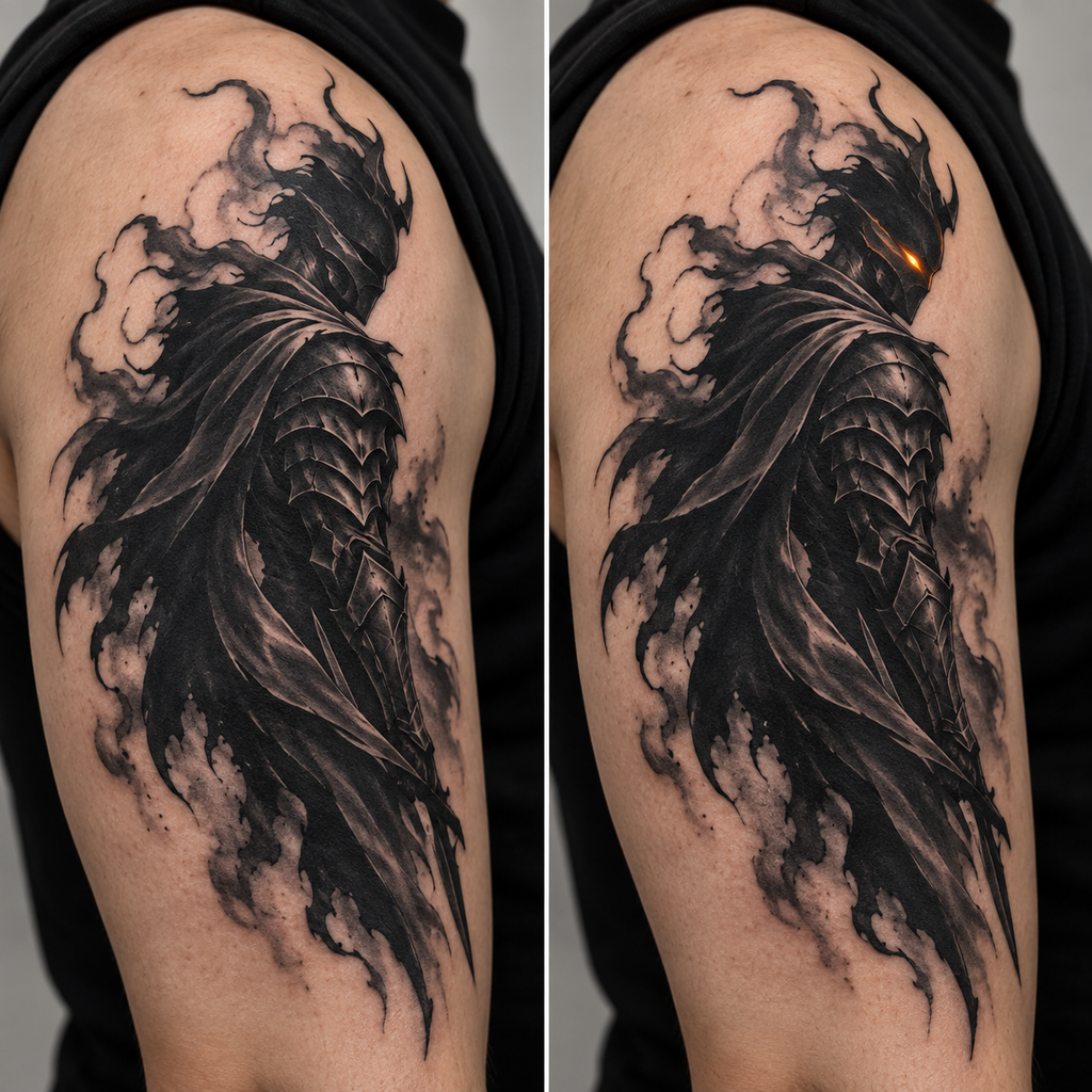
Fans of this style split fairly evenly between two execution choices, and both work — the decision comes down to mood and how the piece will hold up over time.
Black-and-grey is the more common choice for shadow-and-armor subjects like this. It leans into the source material’s own dark, high-contrast tone, and it lets an artist build up deep, layered shading without competing color to manage. A black-and-grey piece also tends to age well, since it relies on tonal range rather than color saturation holding up over years.
Color is the bolder option, and it’s usually reserved for the accent, not the whole piece — a glowing amber or blue eye, a faint ember-orange crack of light through the shadow, or a cool blue rim-light along an armored edge. Used this way, color doesn’t compete with the blackwork; it does the opposite, making the shadow read even darker by contrast. A fully colored piece is less common for this aesthetic specifically because the franchise’s visual power comes from restraint — one point of light against darkness — rather than a full-color palette.
If you’re unsure which to choose, think about what you want the tattoo to communicate: black-and-grey reads as moody and understated, while a color accent adds a sharper, more dramatic focal point. Neither is more “correct” — they’re just different ways of hitting the same shadow-and-light idea.
Solo Leveling Tattoo Ideas — Gallery-Style Inspiration
These are original, non-scene-specific design directions built around the franchise’s visual language — not recreations of any official artwork, cover, or in-universe screen. Bring any of these to an artist as a starting concept, not a literal reference to copy panel-for-panel.
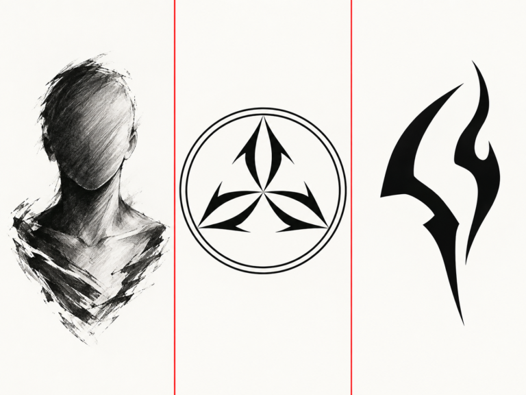
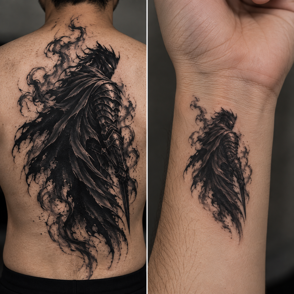
Shadow Monarch-inspired silhouette. A cloaked, armored figure rendered almost entirely in shadow, with a single glowing eye as the only point of light. This is the most direct way to capture the franchise’s core visual idea — restraint and darkness broken by one small, sharp detail. Works well as a centerpiece piece where the shading itself is the main event.
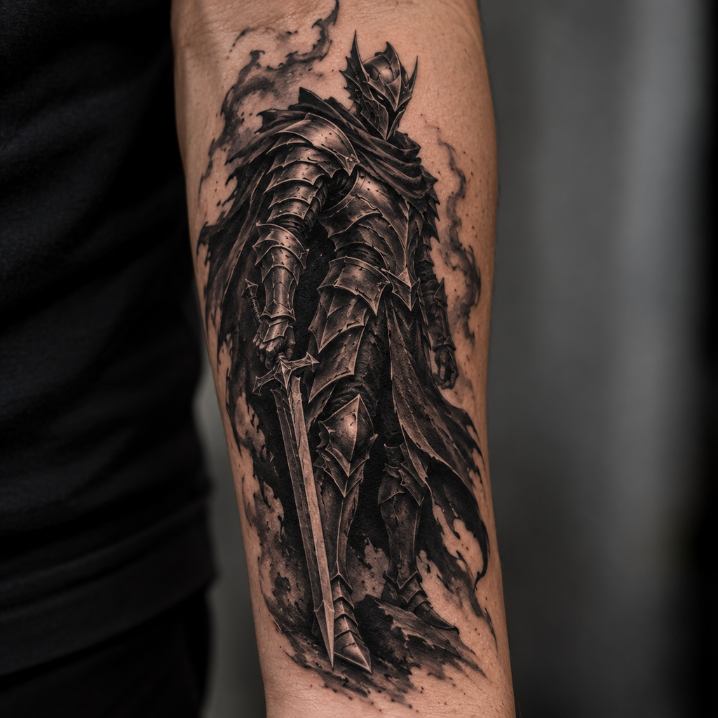
Armored general figure. An original knight- or general-style character in heavy plate armor, shaded in deep black-and-grey with subtle metallic highlighting. This design leans into the “commander” side of the aesthetic rather than the shadow side — more solid, structured linework, less pure atmosphere. A strong option if you want something that reads clearly as a character piece rather than an abstract shadow composition.
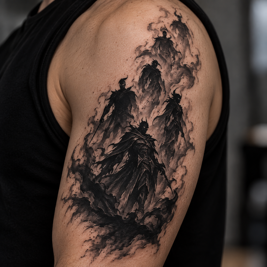
Shadow-army composition. A cluster of smaller silhouette figures rising out of or emerging from a shared pool of shadow at the base. This design idea works especially well as a larger piece since it needs room for the layered figures to read individually rather than blur into a single dark mass.
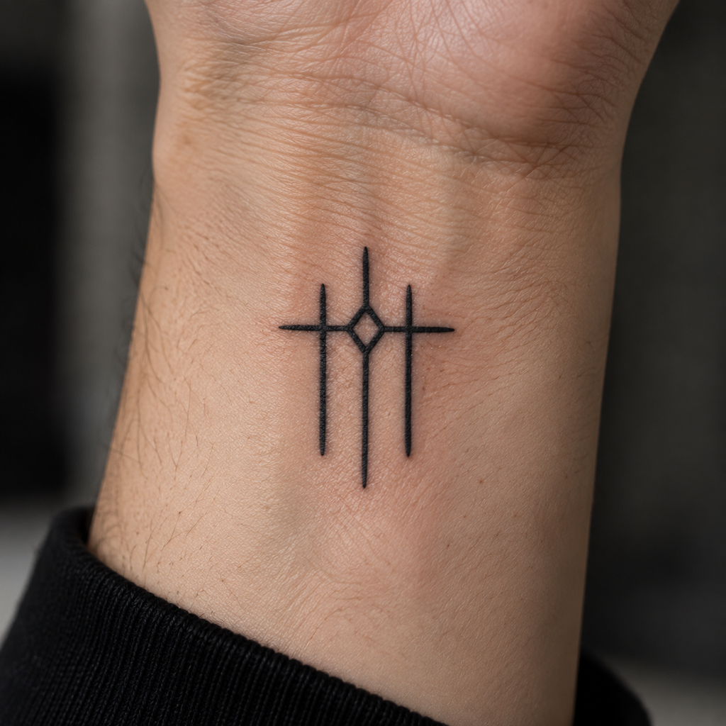
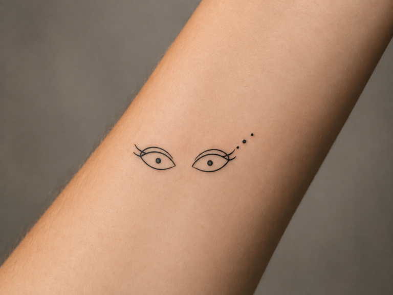
Minimalist rank or gate glyph. A simple geometric symbol — an original rune-like or gate-inspired mark — rendered in clean linework with minimal shading. This is the one direction in this list built for small scale: wrist, behind the ear, or forearm placements where a heavily shaded piece wouldn’t hold up.
Clawed shadow-beast motif. An original creature design built from the same shadow-and-glow visual language — a beast-like figure with a clawed silhouette and a single glowing accent point, similar in spirit to the humanoid designs above but built around a creature rather than a figure. Good for anyone who wants the aesthetic without a human or armored subject.
Across all five, the same principle holds: originality in the specific figure, pose, and composition, while the shadow-and-glow visual language is what ties the piece back to Solo Leveling’s aesthetic.
Placement and Scale Considerations for Shadow and Armor-Heavy Designs
This style asks more of its placement than a simple line-art piece does, because the shading is doing most of the work.
Larger designs — the Shadow Monarch silhouette, the armored general, and especially the shadow-army composition — need real skin real estate to hold their layered shadow shading and armor detail. Forearm, upper arm, and back placements give an artist room to build up the tonal range that makes this style read correctly. Squeeze one of these designs onto a small or heavily curved area and the shading tends to compress into a muddy block instead of a controlled gradient.
Smaller or more curved placements — wrist, ankle, behind the ear — work better with the minimalist rank or gate glyph, since it relies on clean linework rather than deep shading. A heavily shaded piece shrunk down to that scale usually loses the contrast that makes it work in the first place.
If you’re set on a design that’s naturally larger (the shadow-army composition, for example) but want it on a smaller area, talk to your artist about simplifying the composition rather than just scaling it down — fewer figures, tighter framing — so the shading still has room to breathe.
Choosing an Artist for Blackwork and Shadow-Style Realism
Because this aesthetic lives or dies on shading control, portfolio research matters more here than for a flatter, more graphic tattoo style.
Look specifically for blackwork or shadow-realism work in an artist’s portfolio, not just anime tattoos generally. An artist who’s skilled at flat color anime pieces won’t necessarily have the shading control this style needs — they’re genuinely different skill sets.
Pay attention to how an artist handles the light-against-dark relationship in past work: a glowing eye, a rim-light edge, an ember accent. This is the single hardest part of this aesthetic to execute well, since it requires precise contrast control rather than just clean linework. If a portfolio piece has a glowing accent that reads as a bright spot rather than a light source, that’s a sign the shading underneath it isn’t doing enough work.
Check for line-weight consistency in any armor or structural detail, and look at healed photos specifically, not just fresh ones. Heavy black-and-grey shading can shift as it heals, and an artist with a strong healed-photo portfolio has demonstrated their work holds up over time, not just on day one. Because this style leans on longer, more detailed shading work, it’s also worth asking your artist directly about session length for a larger piece before booking, so you know what to expect going in.
Solo Leveling’s tattoo appeal comes down to one relationship: deep shadow shading against a single, deliberate point of light. Whether you go with a Shadow Monarch-inspired silhouette, an armored general figure, or a minimalist glyph, the strongest results come from treating that shadow-and-glow contrast as the actual subject of the piece — not just a color choice layered on top of a character design. Bring an original concept, not a scene reference, choose a placement that gives the shading room to work, and find an artist whose portfolio proves they can control that contrast. That combination is what separates a tattoo that reads as genuinely Solo Leveling-inspired from one that just looks like a dark fantasy piece with the wrong name attached.
Looking for more anime-inspired tattoo direction? Check out our Jujutsu Kaisen Tattoo Ideas: Matching Characters and Symbols to the Right Size, Placement, and Style and Spy x Family Tattoo Ideas: Anya, Loid, Yor, and Bond Designs That Actually Work Small guides, or browse the full Anime Characters pillar hub collection for more design inspiration.